Please note this post may contain affiliate links picked by me (Jay) that I have deemed may be of interest or relevant to you the reader of this.
These links do not affect the cost of the thing if you decide to purchase but i may get a little money if you choose to purchase.
For more information on my affiliate link policy click here.
As a photographer, I'm constantly on the quest for that one technique that can take my images from good to extraordinary. And let me tell you, understanding color theory is that technique.
It's like a secret weapon that can transform your photos into captivating masterpieces. So, if you're ready to step up your photography game and make your images truly stand out, buckle up because we're about to embark on a journey that will revolutionize the way you see and use color in your photographs.
Key Takeaways
- Color theory is essential for creating visually appealing images in photography.
- Color contrast techniques, such as using complementary colors, can create impactful and striking photos.
- Understanding and utilizing color schemes, such as complementary and analogous, can help create harmonious compositions in photography.
- Color grading can enhance the depth and dimension of photographs, adding a multidimensional quality to the images.
Understanding the Basics of Color Theory
Understanding the basics of color theory is essential for any photographer looking to create captivating and visually appealing images. As photographers, we have the unique ability to not only capture moments but also evoke emotions through our use of color. By understanding color schemes and color symbolism, we can take our photography to the next level and truly create innovative and impactful images.
Color schemes refer to the combinations of colors that work harmoniously together. One common color scheme is the complementary scheme, where colors that are opposite each other on the color wheel are used together. This creates a strong contrast and can make certain elements of an image pop. Another popular scheme is the analogous scheme, where colors that are adjacent to each other on the color wheel are used. This creates a more subtle and harmonious effect, perfect for creating a sense of tranquility or unity in your photographs.
Color symbolism, on the other hand, refers to the meaning and associations that different colors have. For example, red is often associated with passion and energy, while blue is associated with calmness and serenity. By understanding these associations, we can use color to convey specific emotions or messages in our photographs. Whether you want to create a sense of excitement, tranquility, or mystery, understanding color symbolism allows you to do so with precision.
Incorporating color theory into your photography won't only make your images visually appealing but also help you convey your intended message to your audience. So, don't be afraid to experiment with different color schemes and use color symbolism to your advantage. By understanding the basics of color theory, you can create innovative and captivating photographs that leave a lasting impact on your viewers.
Using Color Contrast for Impactful Photos
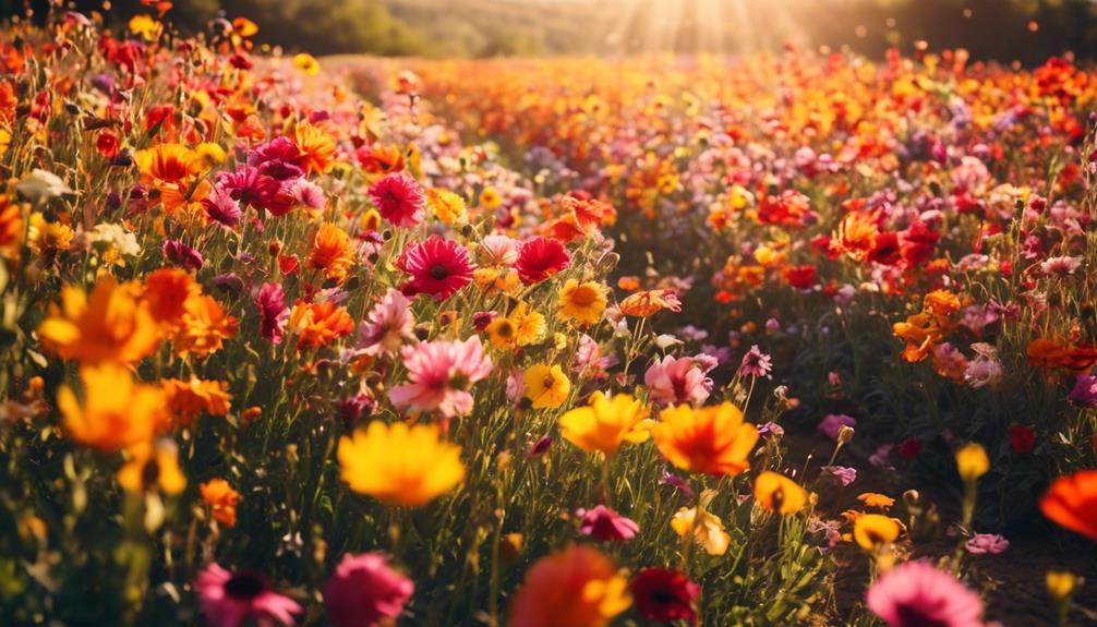
To create impactful photos, harnessing the power of color contrast is key. When exploring complementary colors, you can create a visually striking image that instantly grabs the viewer's attention. Complementary colors are opposite each other on the color wheel, such as red and green or blue and orange. By placing these contrasting colors together in a photograph, you can create a sense of vibrancy and energy.
One way to enhance color contrast is by playing with saturation levels. By increasing the saturation of one color and decreasing it in another, you can create a dynamic visual effect. For example, if you have a photo with a blue sky and a red flower, you can increase the saturation of the red flower to make it appear more vibrant and vivid, while slightly desaturating the blue sky to make the red flower stand out even more.
Another technique to consider is using color contrast to create a focal point in your photo. By placing a subject with complementary colors against a neutral background, you can draw attention to the subject and make it the center of focus. This technique works particularly well in portrait photography, where the subject's clothing or accessories can be used to create color contrast against a plain backdrop.
Creating Harmonious Compositions With Color
Now let's dive into the exciting world of creating harmonious compositions with color, where we can explore the endless possibilities of combining different hues to capture captivating and visually pleasing photographs. When it comes to photography, color plays a vital role in evoking emotions and creating a sense of harmony. By understanding color schemes and achieving color balance, we can elevate our compositions to new levels of creativity.
Color schemes are a powerful tool in creating harmonious compositions. They provide a framework for combining colors in a way that's visually appealing and balanced. One popular color scheme is the complementary scheme, where colors that are opposite each other on the color wheel are used together. This creates a strong contrast that can make your subject stand out. Another effective color scheme is the analogous scheme, which uses colors that are next to each other on the color wheel. This creates a sense of harmony and cohesion in your composition.
Achieving color balance is another important aspect of creating harmonious compositions. Imbalance in color can distract the viewer and take away from the overall impact of your photograph. To achieve color balance, consider the intensity and saturation of your colors. A balanced composition will have a mix of both warm and cool colors, as well as light and dark shades. By carefully selecting and arranging colors within your frame, you can create a visually pleasing and harmonious composition.
Incorporating color theory techniques into your photography will allow you to create compositions that aren't only visually stunning but also emotionally impactful. Experiment with different color schemes and strive for balance in your compositions. By doing so, you'll be able to capture photographs that are truly captivating and innovative.
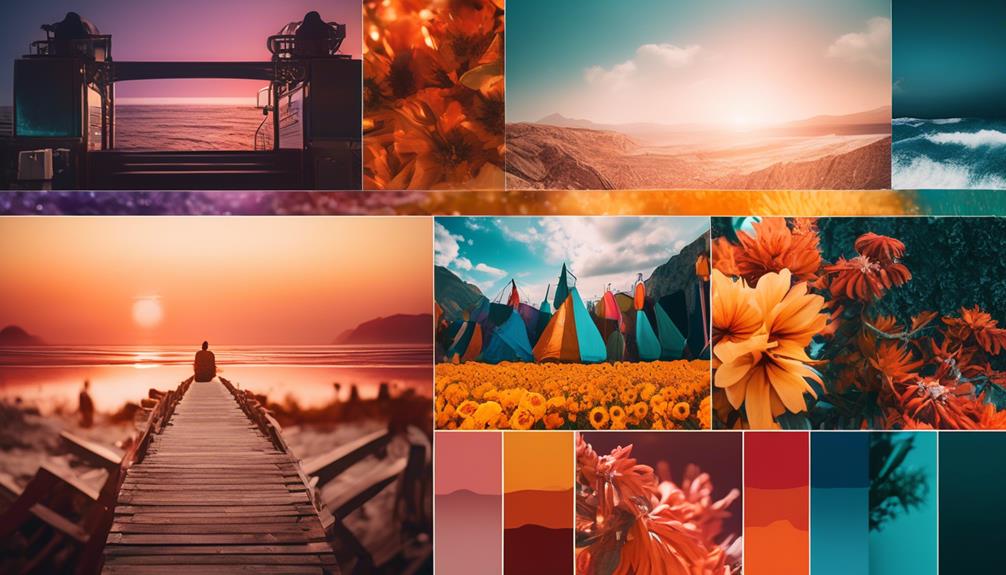
Enhancing Depth and Dimension With Color Grading
Enhancing depth and dimension with color grading adds a captivating and multidimensional quality to your photographs. By incorporating color grading techniques, you can create cinematic looks that bring your images to life. Color grading allows you to manipulate the colors in your photographs, enhancing certain tones and creating a more dynamic visual experience.
To understand the impact of color grading on depth and dimension, let's take a look at the following table:
| Before Color Grading | After Color Grading |
|---|---|
| Flat and dull colors | Vibrant and rich tones |
| Limited tonal range | Increased contrast |
| Lack of depth | Enhanced texture and details |
| Monotonous atmosphere | Dramatic and immersive feel |
As you can see, color grading has the power to transform your photographs from ordinary to extraordinary. By adjusting the colors and tones, you can bring out the hidden details and textures, making your images more visually appealing.
When incorporating color grading techniques, consider the mood and atmosphere you want to convey in your photograph. Warm tones can create a cozy and inviting feel, while cool tones can evoke a sense of tranquility and serenity. Experiment with different color combinations to find the perfect balance that enhances the depth and dimension of your image.
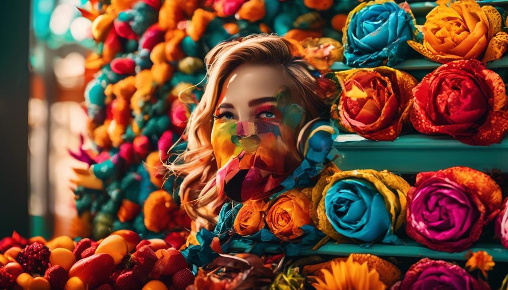
Utilizing Color Psychology to Evoke Emotions in Photography
By utilizing color psychology, photographers have the ability to evoke powerful emotions in their images. Understanding the symbolism of colors in photography allows us to tap into the subconscious mind of our viewers, creating a deeper connection and resonating with their emotions. Colors have the power to convey specific feelings and moods, and as photographers, we can use this knowledge to our advantage.
Each color carries its own symbolism and meaning. For example, warm colors like red and orange are often associated with passion, energy, and intensity. They can evoke feelings of excitement and warmth. On the other hand, cool colors like blue and green are often associated with calmness, tranquility, and serenity. They can create a sense of peace and relaxation in an image. By strategically incorporating these colors into our compositions, we can guide the viewer's emotions and enhance the overall impact of our photographs.
Color temperature also plays a crucial role in evoking emotions. Warm colors, such as those with a higher color temperature, tend to create a sense of coziness and intimacy. They can make a scene feel inviting and comfortable. In contrast, cool colors, with a lower color temperature, can evoke a sense of distance and detachment. They can create a more somber and contemplative mood. By understanding the impact of color temperature on emotions, we can use it to our advantage when composing our photographs.
Frequently Asked Questions
Can Color Theory Techniques Be Applied to Black and White Photography?
Color theory techniques can indeed be applied to black and white photography. By understanding the principles of color and how they interact, I can use techniques like contrast and tonal range to create visually striking black and white images.
These techniques can be especially effective in landscape photography, where the use of different shades of gray can add depth and dimension to the scene.
Are There Any Specific Camera Settings or Equipment That Can Help Enhance the Colors in My Photos?
To enhance the colors in your photos, specific camera settings and equipment can make a big difference. Adjusting the white balance, for example, can help bring out vibrant hues.
Using a polarizing filter can also deepen colors and reduce glare.
And don't forget about post-processing! Editing software allows you to fine-tune the colors and make them pop even more.
How Can I Use Color Theory Techniques to Capture the Essence of a Specific Season or Time of Day in My Photographs?
Capturing seasonal colors and using color theory in landscape photography is a game-changer for me. It allows me to truly capture the essence of a specific season or time of day in my photographs.
By understanding how colors interact and complement each other, I can create stunning images that evoke a certain mood or atmosphere. It's all about experimenting with different color combinations and using them to enhance the beauty of nature.
Trust me, once you start using color theory techniques, your photography will never be the same!
Are There Any Common Mistakes Photographers Make When Using Color Theory Techniques?
Common mistakes when using color theory techniques in photography include:
- Overusing or misusing certain colors
- Failing to consider the impact of lighting on color
- Not paying attention to color harmony
To avoid these pitfalls, here are some tips and tricks:
- Experiment with different color combinations
- Understand the emotional impact of colors
- Study the work of experienced photographers for inspiration
Can You Provide Some Examples of Famous Photographers Who Have Successfully Used Color Theory Techniques in Their Work?
There are many famous photographers who've successfully used color theory techniques in their work. They've applied these techniques to both color and black and white photography, enhancing the colors in their photos with specific camera settings or equipment.
Conclusion
In conclusion, color theory techniques can greatly enhance your photography by adding impact, harmony, depth, and emotions to your images.
By understanding the basics of color theory and using contrast, composition, and color grading effectively, you can create visually stunning and captivating photographs.
So, why not explore the world of color and take your photography to the next level?
Are you ready to infuse your images with the power of color?