Please note this post may contain affiliate links picked by me (Jay) that I have deemed may be of interest or relevant to you the reader of this.
These links do not affect the cost of the thing if you decide to purchase but i may get a little money if you choose to purchase.
For more information on my affiliate link policy click here.
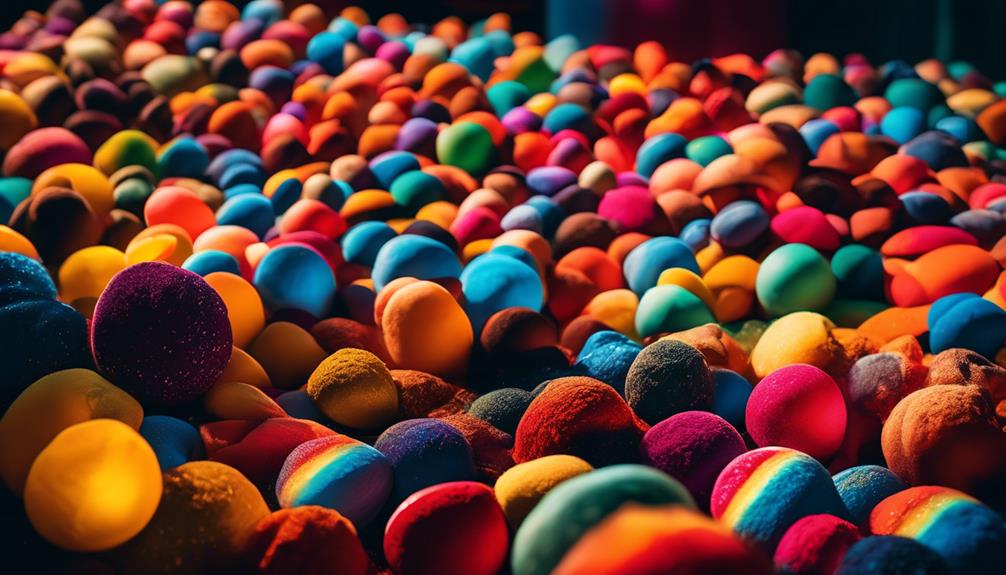
Colors are the brushstrokes that add depth and emotion to a photograph, like a symphony of hues painting a masterpiece. As a new photographer, understanding color theory is not just a nice-to-know, it's a must-know. It's the secret ingredient that can transform your images from ordinary to extraordinary.
But what exactly does color theory mean for us? How can we harness its power to create captivating photographs that leave a lasting impression? In this discussion, we will explore the basics of color theory, delve into the magic of color harmonies, uncover the impact of color on mood and composition, and discover how to incorporate color theory in our editing process.
So, let's embark on this colorful journey together and unlock the true potential of our photographs.
Key Takeaways
- Color theory is the study of how colors interact and affect emotions and perceptions in photography.
- Understanding color symbolism and psychology can help photographers effectively communicate their intended message and create powerful emotional responses in photographs.
- Color harmonies and the use of warm and cool colors can be used to create specific moods and evoke emotions in photography.
- Incorporating color theory in editing enhances the visual impact and storytelling elements of images, and manipulating colors can create a specific aesthetic and enhance the overall image.
The Basics of Color Theory
When diving into the world of color theory as a new photographer, understanding the basics is essential for creating captivating and visually pleasing images. Color theory is the study of how colors interact and affect our emotions and perceptions. By learning about color symbolism and color psychology, photographers can use colors strategically to convey meaning and evoke specific emotions in their photographs.
Color symbolism refers to the cultural associations and meanings that different colors hold. For example, red is often associated with passion and energy, while blue is linked to tranquility and calmness. Understanding these associations can help photographers create images that effectively communicate their intended message.
Color psychology, on the other hand, explores the psychological effects that different colors have on individuals. Colors can elicit specific emotions and reactions from viewers, such as warmth, excitement, or sadness. By incorporating this knowledge into their work, photographers can create images that evoke powerful emotional responses from their audience.
Understanding Color Harmonies
Now that we've a solid understanding of color symbolism and psychology, let's explore the fascinating world of color harmonies and how they can enhance our photographs.
Color harmonies, also known as color schemes, are combinations of colors that work well together and create a pleasing visual experience. By understanding and utilizing color harmonies, we can elevate our images and evoke specific emotions in our viewers.
Color symbolism in photography plays a crucial role in conveying the intended message and mood. Each color has its own symbolic meaning, and when combined harmoniously, they can enhance the storytelling aspect of our photographs. For example, a warm color harmony consisting of reds, oranges, and yellows can create a sense of warmth, energy, and excitement. On the other hand, a cool color harmony with blues and greens can evoke a feeling of calmness, serenity, and tranquility.
Color psychology, which studies the impact of colors on viewer perception, further emphasizes the importance of color harmonies in photography. Certain color combinations can elicit specific emotional responses from viewers. For instance, complementary color harmonies, where colors opposite each other on the color wheel are used together, can create a dynamic and vibrant visual experience. Analogous color harmonies, where colors adjacent to each other on the color wheel are used together, can create a sense of harmony and unity.
Using Color to Create Mood
Color is a powerful tool that can be used to create specific moods and evoke emotions in photography. As photographers, we've the ability to manipulate color to convey the intended message of our images. By understanding the psychology of color and creating color palettes that align with the desired mood, we can enhance the impact of our photographs.
When it comes to creating color palettes, it's important to consider the emotions that different colors evoke. Warm colors like red, orange, and yellow tend to evoke feelings of energy, passion, and happiness. On the other hand, cool colors like blue, green, and purple can create a sense of calmness, tranquility, and introspection. By choosing a color palette that aligns with the mood you want to convey, you can guide the viewer's emotional response to your photograph.
It's also worth noting that the intensity and saturation of colors can greatly influence the mood of an image. Bold and vibrant colors can create a sense of excitement and intensity, while softer and muted colors can evoke a more dreamy and nostalgic mood. Experimenting with different color combinations and intensities can lead to unique and captivating results.
Enhancing Composition With Color
As a photographer, I find that incorporating color into my composition not only enhances the overall visual impact of my images, but also adds depth and dimension to the storytelling aspect of my work. Utilizing color effectively can help me create images that captivate viewers and communicate my intended message with clarity.
Here are four ways I enhance my composition through the use of color:
- Understanding color psychology: Colors have the power to evoke emotions and influence viewer perception. By understanding the psychological impact of different colors, I can strategically choose hues that align with the mood and message I want to convey. For example, warm tones like red and orange can evoke feelings of passion and energy, while cool tones like blue and green can create a sense of calm and tranquility.
- Creating visual interest through contrasting colors: One way to make my images visually striking is by incorporating contrasting colors. The juxtaposition of complementary colors, such as red and green or blue and orange, creates a dynamic and eye-catching effect. This contrast not only adds vibrancy to my composition but also guides the viewer's attention to specific elements within the frame.
- Using color to establish hierarchy: Color can help me establish a visual hierarchy within my composition. By using bold, saturated colors for the main subject and more muted tones for the background, I can make the subject stand out and draw the viewer's attention to it. This technique helps me guide the viewer's gaze and tell a more compelling visual story.
- Experimenting with color schemes: By exploring different color schemes, such as monochromatic, analogous, or triadic, I can create a cohesive and harmonious composition. Each color scheme has its own unique aesthetic and visual impact, allowing me to experiment with different moods and atmospheres in my images.
Incorporating Color Theory in Editing
When editing my photographs, I incorporate color theory to enhance the visual impact and storytelling elements of my images. Color theory plays a crucial role in fashion photography, as it can evoke specific emotions and convey a particular mood. By understanding the color wheel and its relationship to different skin tones and clothing, I can create harmonious and visually appealing images.
For example, complementary colors, like blue and orange, can create a striking contrast and draw attention to the subject. Similarly, analogous colors, such as yellow and green, can create a sense of harmony and cohesion within the image.
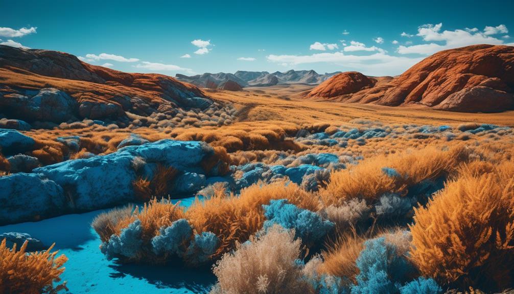
In landscape photography, color theory helps me capture the essence of a scene and convey its atmosphere effectively. By paying attention to the colors present in the environment, I can enhance certain elements and create a more immersive experience for the viewer.
For instance, warm tones like red and orange can evoke a sense of warmth and tranquility in a sunset landscape, while cool tones like blue and green can create a serene and peaceful mood in a mountainous scene.
In the editing process, I use various tools and techniques to manipulate colors and create a specific aesthetic. This may involve adjusting the saturation, hue, and contrast of certain colors to achieve the desired effect. Additionally, I might use color grading techniques to give my images a unique and cohesive look, further enhancing the storytelling elements.
Frequently Asked Questions
What Are Some Common Mistakes to Avoid When Applying Color Theory in Photography?
When it comes to applying color theory in photography, there are some common mistakes that new photographers should avoid.
One of them isn't experimenting enough with different color combinations. Color theory is all about understanding how colors work together, and the importance of experimentation can't be overstated.
By trying out different color schemes and combinations, you can create visually impactful and dynamic photographs that stand out.
How Can I Use Color Theory to Effectively Capture Emotions in My Photographs?
To effectively capture emotions in my photographs, I rely on color theory.
By using color theory in landscape photography, I can create a sense of tranquility with cool blues and greens or evoke energy and excitement with vibrant yellows and oranges.
In portrait photography, incorporating color theory helps me convey different moods and personalities. Warm tones like red and orange can evoke passion and warmth, while cooler tones like blue and purple can create a sense of calm and introspection.
Color theory is a powerful tool for expressing emotions in photography.
Are There Any Specific Color Combinations That Work Best for Certain Genres of Photography?
When it comes to specific color combinations for landscape photography, color theory can truly enhance the storytelling aspect of your images. By understanding how different colors interact and evoke emotions, you can create a powerful visual narrative.
For example, using warm tones like oranges and yellows can convey a sense of warmth and tranquility in a serene landscape scene. On the other hand, contrasting colors like blues and oranges can create a dynamic and eye-catching composition.
Experimenting with different color combinations will allow you to capture the essence of your subject and create captivating photographs.
Can You Provide Some Tips on How to Choose the Right Color Palette for a Specific Subject or Scene?
When it comes to choosing the right color palette for a specific subject or scene in photography, there are a few tips that can really make a difference.
First, consider the mood or emotion you want to convey and choose colors that align with that.
Secondly, think about complementary colors that can create a sense of harmony and balance.
Lastly, don't be afraid to experiment and push the boundaries of traditional color theory.
Is It Necessary to Have a Deep Understanding of Color Theory in Order to Create Visually Appealing Photographs?
Understanding color theory is crucial for creating visually appealing photographs. It enhances composition by allowing you to effectively use colors to create balance, contrast, and harmony.
Moreover, color theory can enhance storytelling in photography by conveying emotions, setting moods, and guiding the viewer's attention.
By applying color theory principles, you can elevate your photographs to a new level, making them more captivating and impactful.
Conclusion
In conclusion, understanding color theory is vital for new photographers to enhance their skills and create impactful photographs. By learning the basics of color theory, such as color harmonies and the use of color to evoke different moods, photographers can effectively compose their shots and captivate their audience.
Did you know that studies have shown that certain colors can evoke specific emotions in viewers? Incorporating color theory in your photography can help you create images that truly resonate with your audience and leave a lasting impression.