Please note this post may contain affiliate links picked by me (Jay) that I have deemed may be of interest or relevant to you the reader of this.
These links do not affect the cost of the thing if you decide to purchase but i may get a little money if you choose to purchase.
For more information on my affiliate link policy click here.
Like a painter with a vibrant palette before them, color theory is the brush that brings life and emotion to our photographs. As a new photographer, the world of color can seem overwhelming, but fear not! In this discussion, I will guide you through the essential tips that will help you master color theory and elevate your photography to new heights.
From understanding the basics of color theory to manipulating color in post-processing, we will explore how to use color temperature, complementary colors, and color harmony to create stunning and captivating images.
So, grab your camera and let's embark on this colorful journey together. You won't want to miss a single tip!
Key Takeaways
- Color symbolism in photography can convey specific meanings and emotions
- Understanding color temperature and its impact on the mood of an image is essential
- Complementary colors create a visually stimulating effect and evoke specific emotions
- Manipulating color in post-processing can enhance the mood and atmosphere of a photograph.
The Basics of Color Theory
When diving into the world of photography, understanding the basics of color theory is essential for capturing captivating and visually striking images. Color symbolism in photography and the psychology of color in visual storytelling play a crucial role in creating impactful photographs that resonate with the audience.
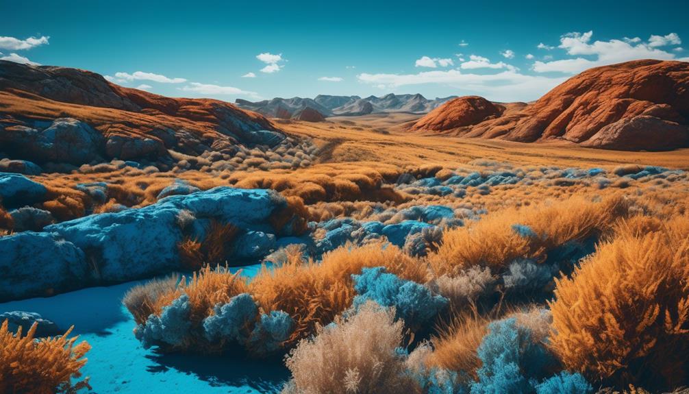
Color symbolism in photography refers to the use of different colors to convey specific meanings or emotions. Each color has its own significance and can evoke a range of emotions. For example, warm colors like red and orange can represent passion, energy, and warmth, while cool colors like blue and green can evoke feelings of calmness and serenity. By understanding these symbols, photographers can use colors strategically to enhance the message or story they want to convey through their images.
The psychology of color in visual storytelling explores how colors can affect the viewer's emotions and perception of an image. Colors have the power to evoke certain moods and feelings. For instance, bright and vibrant colors can create a sense of happiness and excitement, while muted or desaturated colors can convey a somber or nostalgic atmosphere. By carefully selecting and manipulating colors in their photographs, photographers can guide the viewer's emotional response and create a more immersive visual experience.
Understanding Color Temperature
Understanding the concept of color temperature is essential for photographers looking to create visually captivating images. Color temperature refers to the characteristics of light and how it appears in photographs.
Here are some key points to consider when it comes to color temperature:
- White balance and color temperature adjustments:
- White balance is the process of ensuring accurate colors in your photographs by adjusting for the color temperature of the light source.
- Different light sources have different color temperatures, which can result in images appearing too warm (yellow) or too cool (blue). Adjusting the white balance allows you to correct these color shifts and capture the scene as intended.
- The role of color temperature in conveying emotions in photography:
- Warm colors, such as those with a higher color temperature, like orange and red, can evoke feelings of warmth, energy, and passion. They're often associated with sunsets or cozy indoor settings.
- Cool colors, on the other hand, have lower color temperatures and can evoke feelings of calmness, serenity, and detachment. Blues and greens are commonly used to create a sense of tranquility or melancholy.
Understanding color temperature and making appropriate adjustments can greatly enhance the mood and impact of your photographs. By mastering this aspect of color theory, you'll be able to create visually stunning images that evoke the desired emotions from your viewers. So go ahead, experiment with different color temperatures, and let your creativity shine through your photography.
The Impact of Complementary Colors
Complementary colors hold immense power in photography, igniting a visual impact that effortlessly grabs the viewer's attention. Understanding the impact of complementary colors is crucial for any photographer seeking to create captivating and engaging images.
Color psychology plays a significant role in viewer perception. Complementary colors are pairs of colors that are opposite each other on the color wheel, such as blue and orange, or red and green. When used together in a photograph, these colors create a dynamic and visually stimulating effect. The contrast between complementary colors creates a sense of balance and harmony, drawing the viewer's eye to the image.
Using color theory to enhance storytelling in photography is an innovative technique that can produce incredible results. By strategically incorporating complementary colors into your composition, you can evoke specific emotions or convey a particular narrative. For example, using complementary colors to create a warm and cool contrast can represent the conflict between two opposing forces in a story.
Creating Mood With Color Harmony
To truly capture the mood and atmosphere in your photographs, mastering the art of color harmony is essential. By carefully selecting and combining colors, you can create images that evoke specific emotions and convey a powerful message to your audience. Let's explore some techniques that will help you create mood through color harmony:
- Using color psychology to evoke emotions in photography:
Colors have the ability to evoke different emotions in people. For example, warm colors like red and orange can create feelings of excitement and energy, while cool colors like blue and green can evoke a sense of calmness and tranquility. Understanding the psychological effects of colors can help you choose the right palette to reflect the mood you want to convey in your photographs.
- Exploring monochromatic color schemes for dramatic effect:
Monochromatic color schemes involve using different shades, tints, and tones of a single color. This can create a visually striking and dramatic effect in your photographs. By playing with light and dark variations of a color, you can add depth and intensity to your images. Monochromatic color schemes are particularly effective when you want to evoke a specific mood, such as a somber or mysterious atmosphere.
Manipulating Color in Post-Processing
When it comes to enhancing the colors in your photographs, post-processing opens up a world of possibilities to manipulate and transform your images. Color grading techniques and using split toning in post-processing are two powerful methods that can take your photos to the next level.
Color grading techniques involve adjusting the colors in your image to create a specific mood or atmosphere. This can be done by tweaking the saturation, contrast, and hue of different colors. For example, you can make a photo feel warm and cozy by increasing the saturation of warm tones like red and orange, or you can create a cool and serene atmosphere by desaturating the blues and greens.
Another technique you can use is split toning. This involves adding different colors to the highlights and shadows of your image. For instance, you can add a warm orange tone to the highlights and a cool blue tone to the shadows, creating a beautiful and dramatic effect.
Both color grading and split toning can be done using various software programs, such as Adobe Lightroom or Photoshop. These tools offer a wide range of adjustment options, allowing you to experiment and find the perfect look for your image.
Frequently Asked Questions
How Can I Effectively Use Color Theory to Create a Sense of Depth and Dimension in My Photographs?
To effectively utilize color theory in my photographs, I focus on creating depth and dimension. By carefully selecting and combining colors, I can manipulate the viewer's perception of space.
Warm colors such as red and orange tend to advance, while cool colors like blue and green recede. Additionally, contrasting colors can create a sense of depth and separation.
Are There Any Specific Color Combinations That Work Best for Landscape Photography?
In landscape photography, the right color combinations can make all the difference. Complementary colors, like blue and orange, can create a striking and balanced composition. They bring a sense of harmony and depth to the image, making it visually captivating.
Additionally, playing with color temperature can help you create atmosphere in your landscape photographs. Warm tones can evoke a sense of coziness and tranquility, while cooler tones can convey a feeling of serenity or mystery.
Experimenting with different color combinations and temperatures can lead to innovative and captivating results in your landscape photography.
What Are Some Tips for Using Color Theory to Enhance the Emotions Portrayed in Portrait Photography?
When it comes to enhancing the emotions portrayed in portrait photography using color theory, there are a few key tips that can make a big difference.
By understanding how different colors evoke certain moods and emotions, you can strategically incorporate them into your portraits. Warm colors like red and orange can create a sense of energy and passion, while cooler colors like blue and green can evoke calmness and tranquility.
Experimenting with different color combinations can help you create the desired mood and atmosphere in your portraits.
Can You Provide Any Insights on How to Effectively Use Color Theory to Convey a Specific Theme or Concept in Conceptual Photography?
In conceptual photography, using color theory to create a surreal atmosphere is key. By exploring the use of contrasting colors, you can convey a specific theme or concept more effectively.
The juxtaposition of vibrant hues can evoke strong emotions and make a bold statement. It's like painting with light and color, turning ordinary moments into extraordinary visual experiences.
The possibilities are endless, and the results can be truly innovative and captivating.
Are There Any Color Theory Techniques That Can Help in Highlighting a Specific Subject or Object in My Photographs?
Using color theory techniques in photography can be a powerful way to highlight subjects and objects in your compositions. By strategically choosing colors that contrast or complement your subject, you can draw attention to it and make it stand out.
For example, using a complementary color scheme, where you pair colors that are opposite each other on the color wheel, can create a vibrant and eye-catching effect. Experimenting with different color combinations can lead to innovative and visually striking results in your photographs.
Conclusion
Mastering color theory is the secret to unlocking the full potential of your photographs. Understanding the basics, like color temperature and complementary colors, allows you to create captivating images that evoke emotion and leave a lasting impact.
And when it comes to post-processing, the possibilities are endless. With a little manipulation, you can transform an ordinary photo into a vibrant masterpiece that will make jaws drop.
So, grab your camera and dive into the world of color, because it's time to take your photography to the next level.