Please note this post may contain affiliate links picked by me (Jay) that I have deemed may be of interest or relevant to you the reader of this.
These links do not affect the cost of the thing if you decide to purchase but i may get a little money if you choose to purchase.
For more information on my affiliate link policy click here.
As a photographer, I've come to realize that color theory is like the secret ingredient that can take your images from good to breathtaking. It's the brushstroke of a master painter, the melody of a symphony, that adds depth, emotion, and impact to your photographs.
But what exactly is color theory and why does it matter? Well, buckle up because in this discussion, we'll explore the basics of color theory, how it can enhance the mood of your images, and the techniques you can use to apply it both in-camera and during post-processing.
So, if you're ready to take your photography skills to the next level, let's dive into the fascinating world of color theory and discover its transformative power together.
Key Takeaways
- Understanding color theory is essential for photographers to enhance their skills.
- Color choices in photography can evoke specific emotions and set the mood of an image.
- Creating color harmonies and palettes can create visually pleasing and cohesive images.
- Strategic use of color contrast and balance can add depth and dimension to photographs and enhance the emotional impact.
The Basics of Color Theory
When it comes to capturing stunning photographs, understanding the basics of color theory is an essential skill for any photographer. Color theory isn't just about knowing which colors look good together, but also about understanding the psychology behind colors and how they can evoke certain emotions in your audience. By incorporating color theory into your photography, you can take your images to a whole new level and create impactful visuals that resonate with viewers.
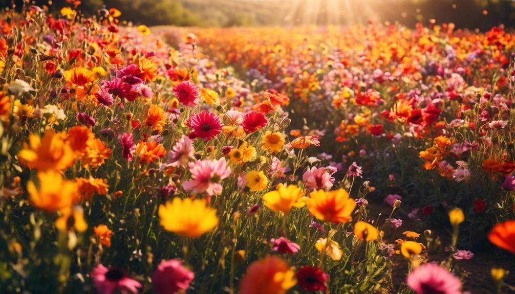
One important aspect of color theory is color psychology. Different colors have the power to evoke specific emotions and create different moods in a photograph. For example, warm colors like red and orange can evoke feelings of energy and excitement, while cool colors like blue and green can create a sense of calmness and tranquility. By understanding the emotional impact of colors, you can use them strategically to convey the desired message or mood in your photographs.
Another key concept in color theory is color temperature. Color temperature refers to the warmth or coolness of a color and is measured in Kelvin. Warm colors have lower color temperatures, while cool colors have higher color temperatures. By understanding color temperature, you can create a specific atmosphere in your photographs. For instance, using warm colors with low color temperatures can create a cozy and inviting feel, while cooler colors with higher color temperatures can give a photograph a more serene and ethereal look.
Incorporating color theory into your photography won't only enhance the visual appeal of your images, but it will also help you tell a more powerful and engaging story. By understanding color psychology and color temperature, you can create photographs that evoke the desired emotions and captivate your audience.
Understanding Color Harmonies
Understanding color harmonies is crucial for photographers who want to create visually pleasing and cohesive images that capture the attention of viewers. By understanding how colors work together, photographers can evoke specific emotions and create a strong impact with their photographs.
Color psychology plays a significant role in photography. Different colors have the power to evoke specific emotions in viewers. For example, warm colors like red and orange can convey feelings of energy, passion, and excitement. On the other hand, cool colors like blue and green can create a sense of calmness, tranquility, and serenity. By strategically using color harmonies, photographers can enhance the mood and atmosphere of their images, making them more memorable and impactful.
Another important aspect of color harmonies in photography is the role of color temperature. Color temperature refers to the warmth or coolness of a color. It's measured in Kelvin and can greatly impact the overall feel of an image. Warmer colors, such as those with a higher color temperature, tend to create a cozy and inviting atmosphere. Cooler colors, with a lower color temperature, can evoke a sense of calmness and tranquility. By understanding how to balance warm and cool colors in their compositions, photographers can create a harmonious and visually striking image.
Enhancing Mood With Color Choices
To create captivating and emotionally impactful photographs, I believe that harnessing the power of color choices is crucial. Colors have the ability to evoke specific emotions and set the mood and atmosphere of an image. By understanding color symbolism and psychology, photographers can effectively enhance the mood and create more compelling visuals.
Here are four ways in which color choices can enhance the mood of your photographs:
- Creating color palettes: Carefully selecting a harmonious combination of colors can greatly influence the mood of your image. Warm tones like red and orange can evoke feelings of warmth, energy, and passion, while cool tones like blue and green can create a sense of calmness and tranquility. Experimenting with different color combinations can help you achieve the desired mood and atmosphere.
- Using color symbolism: Colors have symbolic meanings that can evoke specific emotions or convey certain messages. For example, red is often associated with love, passion, and intensity, while blue can symbolize tranquility and serenity. Understanding the symbolic meanings of colors can allow you to use them strategically to enhance the mood and tell a more powerful visual story.
- Psychological impact: Colors can have a psychological impact on viewers, influencing their emotions and perceptions. For instance, bright and vibrant colors can evoke feelings of joy and excitement, while muted and desaturated colors can create a sense of melancholy or nostalgia. By considering the psychological impact of colors, you can effectively elicit the desired emotional response from your audience.
- Contrast and balance: The contrast between colors can also play a significant role in setting the mood of an image. High contrast between complementary colors can create a dramatic and energetic atmosphere, while low contrast between analogous colors can produce a more harmonious and peaceful mood. Achieving the right balance of contrast and harmony can greatly enhance the emotional impact of your photographs.
Using Color Contrast for Impact
Now that we've explored how color choices can enhance the mood of your photographs, let's delve into the powerful impact of using color contrast.
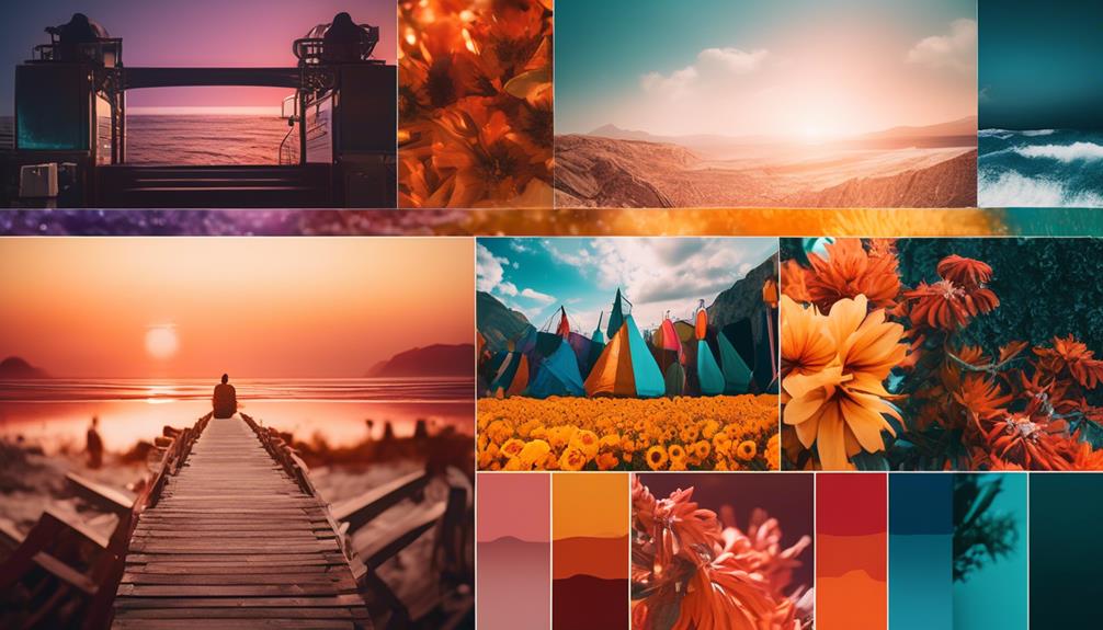
When it comes to capturing emotion through color, contrast plays a vital role. By combining colors that are opposite on the color wheel, such as blue and orange or red and green, you can create a striking visual effect that immediately grabs the viewer's attention. This contrast not only adds visual interest to your photographs but also evokes specific emotions.
For example, the contrast between warm and cool colors can convey a sense of tension or excitement, while the contrast between bright and muted colors can evoke feelings of joy or melancholy.
In addition to capturing emotion, using color contrast can also help create depth in your photographs. By incorporating contrasting colors in the foreground and background, you can add a sense of dimension and make your images appear more three-dimensional.
For instance, placing a subject wearing a bold red outfit against a background of lush green foliage can make the subject pop and create a sense of depth in the image. Similarly, using contrasting colors in different elements of the composition, such as foreground and background, can add layers and complexity to your photographs.
Applying Color Theory in Post-Processing
In post-processing, the application of color theory allows me to enhance the visual impact of my images, bringing out the full potential of my artistic vision. By understanding how colors interact and influence each other, I can create images that aren't only visually appealing but also emotionally impactful.
Here are some ways I apply color theory in post-processing:
- Color grading: By adjusting the overall color balance of an image, I can set the mood and atmosphere. For example, a warm color palette can evoke a sense of coziness and intimacy, while a cool color palette can create a more serene and calming effect.
- Selective color adjustments: By selectively enhancing or desaturating certain colors, I can draw attention to specific elements within an image. This technique can be particularly effective in highlighting a subject or creating a focal point.
- Color contrast: By deliberately placing complementary colors or contrasting hues next to each other, I can create visual interest and make certain elements pop. This technique can add depth and dimension to an image, making it more engaging to the viewer.
- Color harmony: By using analogous colors or colors within the same color scheme, I can create a sense of unity and coherence in my images. This technique can make an image feel more balanced and harmonious, resulting in a more pleasing visual experience.
Frequently Asked Questions
What Is the History of Color Theory and How Has It Evolved Over Time?
The evolution of color theory and its impact on art have been fascinating.
Over time, color theory has developed from ancient civilizations' use of natural pigments to modern scientific understanding of color perception.
Artists, such as the Impressionists, used color theory to create vibrant and emotionally evocative works.
Understanding the history of color theory allows us to appreciate the depth and richness of color in art.
It's incredible how something as simple as color can have such a profound impact on our artistic expressions.
How Does Color Theory Affect the Perception of Depth and Dimension in a Photograph?
Color theory plays a crucial role in enhancing the perception of depth and dimension in a photograph. By understanding how colors interact and complement each other, I can strategically use them to create a sense of depth in my images.
Colors can create visual impact, making certain elements appear closer or farther away. This knowledge allows me to capture more dynamic and captivating photos, pushing the boundaries of traditional photography and offering a fresh and innovative perspective to my audience.
Are There Any Specific Cultural or Psychological Factors to Consider When Applying Color Theory in Photography?
When considering color theory in photography, it's essential to understand the cultural influences and psychological impact it can have.
Colors carry meaning and symbolism that vary across different cultures, so being aware of these factors allows you to create more meaningful and impactful photographs.
Additionally, colors can evoke specific emotions and moods, affecting how people perceive and engage with your images.
Can Color Theory Be Used to Enhance the Composition and Visual Flow of a Photograph?
Color theory is an essential tool for any photographer looking to enhance the composition and visual flow of their photographs. By understanding how different colors interact and evoke emotions, I can use color theory to create captivating landscape shots or compelling portraits.
Are There Any Common Mistakes or Misconceptions When Applying Color Theory in Post-Processing?
When applying color theory in post-processing, it's important to be aware of common mistakes and misconceptions.
One common mistake is over-saturating colors, which can make the image look unrealistic.
Another misconception is that color theory is only about choosing complementary colors, when in reality, it involves understanding the emotional impact of different color combinations.
Conclusion
In conclusion, understanding color theory is essential for boosting your photography skills.
By learning the basics of color theory, understanding color harmonies, and using color contrast effectively, you can enhance the mood and impact of your photographs.
Additionally, applying color theory in post-processing allows you to further manipulate and enhance the colors in your images.
So, if you want to take your photography to the next level, dive into the world of color theory and watch your skills soar.
Stay tuned for more exciting tips and tricks in the world of photography!