Please note this post may contain affiliate links picked by me (Jay) that I have deemed may be of interest or relevant to you the reader of this.
These links do not affect the cost of the thing if you decide to purchase but i may get a little money if you choose to purchase.
For more information on my affiliate link policy click here.
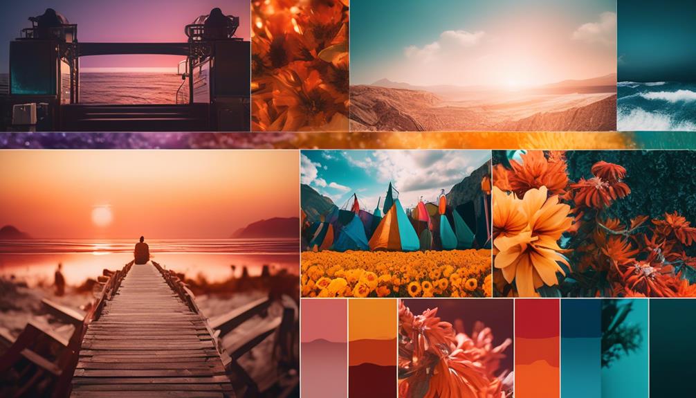
As a photographer, I have come to realize that colors hold the key to unlocking the true potential of my images. They are like the paintbrushes on a palette, allowing me to paint emotions, tell stories, and capture the essence of a moment.
But there's a secret language hidden within the world of colors, a theory that can elevate my photography skills to new heights. In this discussion, I will reveal nine color theory secrets that have helped me transform ordinary photographs into extraordinary works of art.
From understanding the color wheel to harnessing the power of contrasting colors, exploring color temperature, and utilizing color psychology, these secrets will not only enhance the visual impact of my images, but also evoke emotions, convey moods, and create a lasting impression.
Get ready to embark on a colorful journey that will forever change the way you see and capture the world through your lens.
Key Takeaways
- Understanding color theory is essential for creating captivating and harmonious images.
- Complementary colors create balance and harmony in compositions.
- Contrasting colors add depth and visual impact to photographs.
- Color temperature enhances the mood of photographs.
Understanding the Color Wheel
Understanding the color wheel is essential for any photographer looking to create captivating and harmonious images. As a photographer myself, I can't emphasize enough the importance of color in photography. The color wheel serves as a powerful tool that allows us to understand the relationships between different colors and how they can impact our compositions.
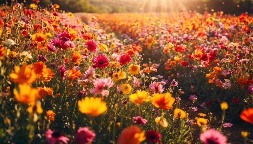
Color symbolism in photography is a fascinating aspect that adds depth and meaning to our images. Each color carries its own symbolism and can evoke specific emotions and moods. For example, warm colors like red and orange often symbolize passion and energy, while cool colors like blue and green can evoke feelings of calmness and tranquility. By understanding color symbolism, we can intentionally use colors to convey our intended message and evoke the desired emotional response from viewers.
Moreover, the impact of color on composition can't be underestimated. The way colors are arranged and combined in a photograph can greatly affect its visual impact. Colors can create balance, contrast, and focal points within an image. By using complementary colors, which are opposite each other on the color wheel, we can create vibrant and eye-catching compositions. On the other hand, analogous colors, which are adjacent on the color wheel, can produce harmonious and soothing images.
Innovative photographers have been pushing the boundaries of color in photography, experimenting with unconventional color combinations and exploring the power of color symbolism. By understanding the color wheel and its principles, we can join them in creating visually stunning and emotionally impactful images. So, let's dive into the world of colors and unlock the secrets that lie within the color wheel.
Using Complementary Colors
Now let's explore the captivating world of using complementary colors to create visually striking and dynamic compositions in photography.
Complementary colors are pairs of colors that are opposite each other on the color wheel. When used together, they create a powerful visual impact that can elevate your photographs to a whole new level.
One of the key advantages of using complementary colors is that they create a sense of color balance and harmony in your images. By strategically placing these colors in your composition, you can create a dynamic interplay between warm and cool tones, or between vibrant and muted colors. This creates a visual tension that can draw the viewer's eye and create a sense of excitement and interest.
To effectively use complementary colors, it's important to understand how they interact with each other. When complementary colors are placed side by side, they intensify each other, creating a vibrant and energetic effect. For example, pairing a deep blue with a bright orange can create a stunning contrast that immediately captures attention. On the other hand, using complementary colors in a more subtle way, such as incorporating small accents or details, can add depth and richness to your compositions.
Experimenting with complementary colors can open up a world of creative possibilities in your photography. Don't be afraid to play with different combinations and see how they transform your images. Remember, the key is to find a balance between the colors, creating a harmonious and visually pleasing composition.
Exploring the Power of Contrasting Colors
Contrasting colors have the ability to create a visual impact that grabs attention and adds depth to your photographs. As a photographer, I've discovered the power of using contrasting colors to enhance the overall composition and evoke emotions in my viewers. It's not just about capturing a beautiful scene, but also about utilizing color theory to create captivating images that leave a lasting impression.
One technique that I've found particularly effective is using color filters for creative effect. By experimenting with different filters, I can manipulate the colors in my photographs to create a more dramatic and eye-catching result. For example, I might use a red filter to intensify warm tones and create a sense of warmth and passion in a portrait, or a blue filter to enhance the coolness and tranquility of a landscape.
Furthermore, exploring the impact of color psychology on viewer perception has been a game-changer for me. Colors have the ability to evoke specific emotions and influence how people perceive an image. By understanding the psychology behind colors, I can strategically incorporate contrasting hues to create a desired mood or atmosphere in my photographs. For instance, pairing vibrant red and calming green can create a strong contrast that symbolizes energy and calmness simultaneously.
Innovation in photography lies in pushing the boundaries and experimenting with new techniques. By harnessing the power of contrasting colors, using color filters creatively, and understanding the impact of color psychology, I've been able to take my photography to new heights. The results are visually striking images that captivate viewers and leave a lasting impression.
Creating Harmonious Color Schemes
In my exploration of color theory secrets for photography, I've discovered that creating harmonious color schemes is essential for capturing captivating and visually striking images. Color symbolism plays a significant role in photography, as different colors evoke different emotions and convey different messages. By understanding how colors interact and harmonize with each other, photographers can elevate their work to new heights.
Color harmony techniques are the key to creating visually pleasing images. One popular technique is the use of complementary colors. Complementary colors are opposite each other on the color wheel, such as blue and orange or red and green. When used together, they create a vibrant contrast that instantly grabs the viewer's attention.
Another technique is the use of analogous colors, which are colors that are adjacent to each other on the color wheel, like blue and purple or yellow and green. This creates a harmonious and soothing effect, perfect for creating a serene landscape or a calming portrait.
It is crucial to consider the message you want to convey through your photographs and choose color schemes accordingly. For example, warm colors like red, orange, and yellow are often associated with energy, passion, and excitement. On the other hand, cool colors like blue and green can evoke feelings of tranquility, peace, and serenity.
Enhancing Mood With Color Temperature
Enhancing the mood of your photographs can be achieved through the strategic use of color temperature. By understanding the concept of warm versus cool tones and employing effective color grading techniques, you can create captivating and emotionally engaging images.
Here are four key ways to enhance the mood of your photographs using color temperature:
- Warm tones: Incorporating warm colors, such as reds, oranges, and yellows, can evoke feelings of warmth, intimacy, and energy. These tones are often associated with sunsets, firelight, and cozy environments. By using warmer color temperature settings or adding warm filters during post-processing, you can infuse your images with a sense of comfort and passion.
- Cool tones: On the other hand, cool colors like blues and greens can convey a sense of calmness, tranquility, and serenity. These tones are often found in landscapes, bodies of water, and nighttime scenes. Adjusting your color temperature settings to cooler tones or applying cool filters can create a peaceful and soothing atmosphere in your photographs.
- Contrast and balance: Combining warm and cool tones in your images can bring about a harmonious contrast, intensifying the visual impact. Experiment with contrasting colors to create a dynamic composition that captures attention and adds depth to your photographs. Achieving a balance between warm and cool tones is key to creating a visually pleasing and emotionally impactful image.
- Color grading techniques: Utilizing color grading techniques in post-processing can further enhance the mood of your photographs. Adjusting the white balance, tweaking the saturation levels, or applying color filters can give your images a distinct and desired mood. Experiment with different techniques to find the perfect color grading style that complements your subject and evokes the desired emotions.
Playing With Color Saturation and Vibrancy
As we continue our exploration of color theory secrets for photography, let's now dive into the fascinating world of playing with color saturation and vibrancy. This aspect of color grading techniques allows us to enhance the visual impact of our photographs, making them more vibrant and captivating.
Color saturation refers to the intensity or purity of a color, while vibrancy relates to the perceived strength and energy of an image. By adjusting these elements, we can create stunning visual effects and evoke specific emotions in our viewers.
Color grading software and editing tools provide various ways to manipulate saturation and vibrancy. One popular method is through color balance adjustments, which allow us to fine-tune the color distribution in our images. By increasing the saturation of certain hues, we can make them more vivid and eye-catching. Conversely, desaturating certain colors can create a more subdued and moody atmosphere.
Experimenting with color saturation and vibrancy can lead to unique and innovative results. It allows us to push the boundaries of traditional photography and create images that stand out from the crowd. By understanding the principles of color theory and playing with saturation and vibrancy, we can elevate our photography to new heights.
Utilizing Color Psychology in Photography
Color psychology plays a crucial role in photography, allowing us to evoke specific emotions and create powerful visual narratives. As photographers, we've the ability to harness the impact of color symbolism in our images, using it as a tool to communicate and connect with our audience.
Here are four ways to utilize color psychology in photography:
- Emotion evoking colors in photography: Different colors have the power to evoke specific emotions. For example, warm colors like red and orange can evoke feelings of passion and energy, while cool colors like blue and green can create a sense of calm and tranquility. By understanding the emotional impact of colors, we can strategically incorporate them into our compositions to enhance the mood and atmosphere of our photographs.
- The impact of color symbolism in visual storytelling: Colors have cultural associations and symbolic meanings that can add depth and meaning to our visual storytelling. For example, red can symbolize love, passion, or danger, while yellow can represent happiness or caution. By incorporating colors with specific symbolism into our photographs, we can convey messages and narratives that resonate with our audience on a deeper level.
- Contrasting colors for visual impact: The use of contrasting colors can create visual impact and draw attention to specific elements in our photographs. Complementary colors, such as blue and orange or red and green, create a strong visual contrast that can make our subjects pop and grab the viewer's attention. By understanding color theory and utilizing contrasting colors in our compositions, we can create visually striking images that leave a lasting impression.
- Color harmony for a cohesive composition: On the other hand, creating a harmonious color palette can help to create a sense of balance and unity in our photographs. Analogous colors, which are located next to each other on the color wheel, create a harmonious and visually pleasing effect. By using analogous colors in our compositions, we can create a cohesive and balanced image that's pleasing to the eye.
Incorporating Color Blocking Techniques
One powerful technique that can elevate your photography is the incorporation of color blocking.
Color blocking involves using bold, contrasting colors to create visually striking images that captivate the viewer's attention. By strategically placing colors in different areas of your composition, you can create a sense of balance, depth, and visual storytelling in your photographs.
Color blocking isn't only visually appealing but also has a strong impact on the emotions and perception of the viewer. Colors have the power to evoke specific feelings and moods, and by understanding color psychology in branding, you can harness this power to enhance the message conveyed in your photographs.
For example, using warm colors like red and orange can evoke excitement, energy, and passion, while cool colors like blue and green can create a sense of calmness and tranquility. By using color blocking, you can amplify these emotions and create a more impactful visual narrative.
Incorporating color blocking into your photography requires careful consideration of color combinations and their placement within the frame. Experiment with different color palettes and combinations to find what works best for your desired effect. Remember that color blocking is about creating a visual impact, so don't be afraid to be bold and experiment with contrasting colors.
When utilizing color blocking, consider the principles of composition, such as the rule of thirds, leading lines, and symmetry, to create a visually balanced and harmonious image. Balance the colors within your frame to ensure that no single color dominates the composition, while still maintaining a strong visual impact.
Incorporating color blocking techniques in your photography allows you to create visually stunning images that not only capture attention but also convey a powerful message. By understanding color psychology in branding and applying it to your compositions, you can take your photography to the next level and create compelling visual stories that resonate with your audience.
Mastering Color Editing and Post-Processing Techniques
With a mastery of color editing and post-processing techniques, I can transform ordinary photographs into vibrant and captivating works of art. By employing advanced color grading techniques and following color correction tips, I can enhance the visual impact of my images and create stunning results.
Here are four techniques that will take your color editing skills to the next level:
- Selective color adjustments: By selectively adjusting the colors in different parts of the image, you can create a focal point and guide the viewer's attention. For example, you can make the subject stand out by desaturating the background or intensify the colors in specific areas to add drama and depth.
- Color toning: Experiment with different color tones to evoke specific moods and emotions in your photographs. Warm tones like red and orange can create a cozy and inviting atmosphere, while cool tones like blue and green can convey a sense of calmness or mystery. Find the right balance to enhance the overall mood of your image.
- Gradient mapping: This technique allows you to map specific colors to different tonal ranges, giving your photos a unique and artistic look. By carefully choosing the colors and adjusting the gradients, you can create a dramatic and eye-catching effect that sets your image apart.
- Color blending: Blend different colors together to create harmonious and visually pleasing compositions. Experiment with blending modes and opacity levels to achieve the desired effect. This technique can add depth and dimension to your images, making them more engaging and captivating.
Frequently Asked Questions
How Can Color Theory Be Applied to Other Forms of Art Besides Photography?
Color theory isn't limited to photography; it can be applied to other art forms as well. In abstract painting, understanding color theory helps create harmonious compositions and evoke emotions. By using complementary colors or playing with warm and cool tones, artists can create visual impact and depth.
Similarly, in graphic design, color theory is crucial for creating eye-catching visuals, conveying messages, and establishing brand identities. Applying color theory in these art forms allows for endless possibilities and innovative creations.
Are There Any Limitations or Drawbacks to Using Complementary Colors in Photography?
Using complementary colors in photography can have some limitations and drawbacks.
One limitation is that it can be challenging to find the right balance between the colors, as they can easily overpower each other.
Additionally, using complementary colors exclusively can limit the overall color palette of your photographs, potentially making them feel repetitive or predictable.
However, when used strategically and in moderation, complementary colors can create powerful and visually striking images that capture the viewer's attention.
Can Contrasting Colors Be Used Effectively in Black and White Photography?
Contrasting colors can be used effectively in black and white photography to create striking and dramatic images. By playing with the tones and shades of different colors, you can enhance the visual impact and evoke strong emotions in your viewers.
The juxtaposition of light and dark, and the interplay of contrasting colors, adds depth and dimension to your photos. It's a creative technique that allows you to explore the impact of color temperature on emotions in photography, resulting in innovative and captivating images.
What Are Some Examples of Color Schemes That Evoke Specific Emotions or Moods in Photography?
When it comes to photography, color schemes can make all the difference in evoking emotions and moods.
For example, warm colors like red and orange can create a sense of passion and energy in landscape photography.
On the other hand, cool colors like blue and green can bring a calming and serene vibe to portrait photography.
It's amazing how a simple choice of colors can completely transform the feel of an image and captivate the viewer's imagination.
How Can Color Blocking Techniques Be Used to Create a Focal Point in a Photograph?
Color blocking techniques are an incredible way to create a captivating focal point in a photograph. By strategically placing contrasting colors together, you can instantly draw the viewer's attention to a specific area of the image. This technique adds a dynamic element to your composition and creates a strong visual impact.
Whether you're highlighting a subject, emphasizing a particular detail, or simply adding a pop of color, color blocking techniques can elevate your photography skills and make your images truly stand out.
Conclusion
In conclusion, understanding and utilizing color theory can greatly enhance your photography skills. Did you know that using complementary colors can make your photos more visually striking?
Studies have shown that photographs with contrasting colors receive 180% more engagement on social media platforms. So, by applying these color theory secrets, you can't only capture stunning images but also grab the attention of your audience and evoke a strong emotional response.
Start experimenting with color and see your photography skills soar!