Please note this post may contain affiliate links picked by me (Jay) that I have deemed may be of interest or relevant to you the reader of this.
These links do not affect the cost of the thing if you decide to purchase but i may get a little money if you choose to purchase.
For more information on my affiliate link policy click here.
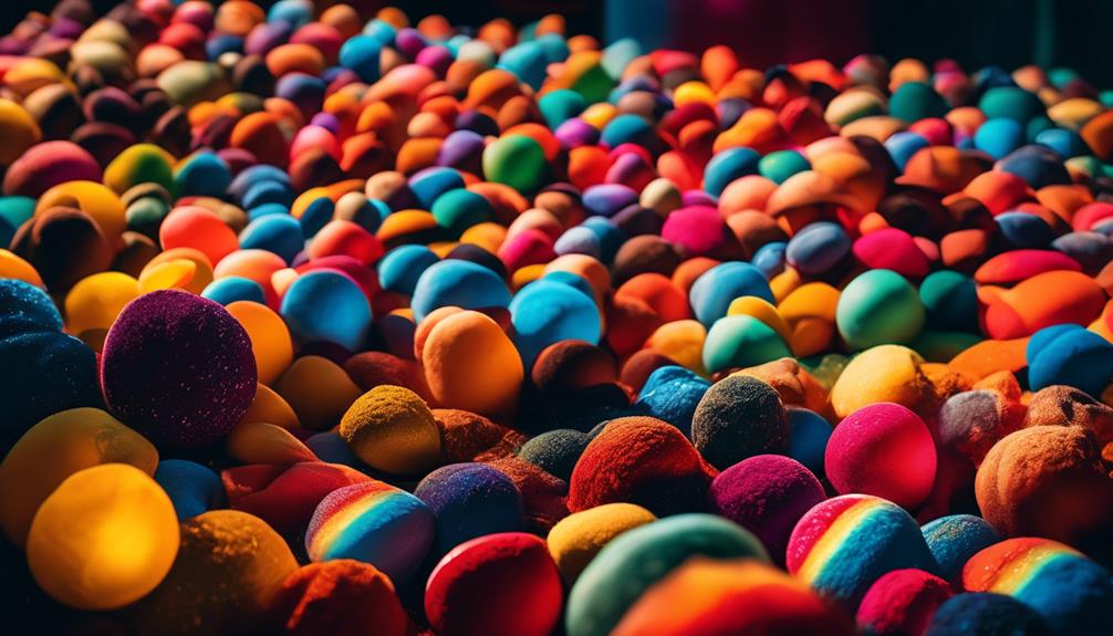
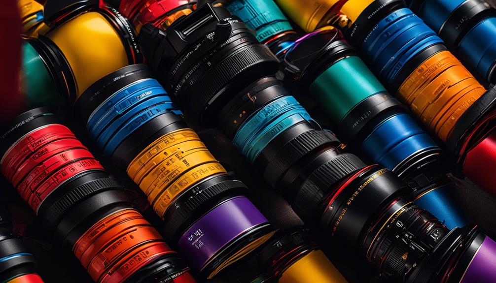
Color theory is the paintbrush that adds depth and vibrancy to your photographs, turning them from mere snapshots into works of art that captivate the viewer's eye. As newbie photographers, we often focus on mastering our camera settings and composition techniques, but understanding the basics of color theory can take our images to the next level.
From the mesmerizing interplay of complementary colors to the emotional impact of warm and cool tones, there is a whole world of possibilities waiting to be explored.
So, if you're ready to unlock the secrets of color theory and elevate your photography skills, join me on this colorful journey where we'll uncover the 8 best color theory basics that every newbie photographer should know.
Key Takeaways
- Understanding color theory is crucial for creating captivating and visually striking images.
- The color wheel and color mixing techniques are essential tools for harnessing the power of color symbolism and creating harmonious photographs.
- Complementary colors and contrast can enhance storytelling and elevate the visual appeal of images.
- The choice of warm or cool colors greatly impacts the mood and emotions conveyed in photographs, and mastering white balance is key to achieving the desired color temperature.
The Importance of Color Theory
Understanding the importance of color theory is essential for newbie photographers to create captivating and visually striking images. Color plays a significant role in photography, as it has the power to evoke emotions, convey messages, and tell stories. By using color symbolism in photography, photographers can enhance their images and create a deeper connection with their viewers.
Color symbolism refers to the meaning and associations that different colors hold. Each color has its own unique significance, and understanding these meanings can help photographers convey specific messages and moods in their images. For example, warm colors like red and orange often symbolize energy, passion, and excitement, while cool colors like blue and green represent calmness, tranquility, and nature.
In addition to color symbolism, mastering color grading techniques is also crucial for newbie photographers. Color grading involves adjusting and enhancing the colors in an image to achieve a desired look and feel. It allows photographers to manipulate the colors to create a specific mood or atmosphere, whether it's a warm and cozy scene or a cool and mysterious one.
Understanding the Color Wheel
The color wheel is a fundamental tool for photographers, providing a visual representation of how colors relate to each other and allowing for endless creative possibilities. Understanding the color wheel is essential for harnessing the power of color symbolism and effectively using color temperature in photography.
Color symbolism plays a vital role in conveying emotions and messages in your photographs. Each color has its own unique meaning and can evoke different feelings in viewers. For example, red is often associated with passion and energy, while blue is known for its calming and soothing qualities. By understanding the color wheel, you can strategically choose colors that align with your intended message and enhance the impact of your images.
Color temperature, on the other hand, refers to the warmth or coolness of a color. It's measured in Kelvin and can greatly influence the mood and atmosphere of a photograph. Warmer colors, such as those found in sunset or candlelight scenes, create a cozy and intimate feel, while cooler tones, like those in snowy landscapes, evoke a sense of tranquility and serenity. By manipulating color temperature, you can add depth and dimension to your images, making them more captivating and engaging.
Primary, Secondary, and Tertiary Colors
Now that we've a basic understanding of the color wheel, let's explore the world of primary, secondary, and tertiary colors and uncover the endless possibilities they hold for our photography.
Understanding primary colors is crucial because they can't be created by mixing other colors. They're the building blocks of all other colors. Red, blue, and yellow are considered the primary colors. By combining them, we can create an infinite number of secondary colors. Secondary colors include green, purple, and orange. These colors are created by mixing two primary colors together.
Lastly, we've tertiary colors. These are created by mixing a primary color with a neighboring secondary color. For example, red-orange or blue-green. Tertiary colors give us even more options to work with and allow us to create unique and vibrant photographs.
When it comes to color mixing techniques, understanding primary, secondary, and tertiary colors is essential. By using the right combination of colors, we can create harmonious and visually appealing photographs. Experimenting with different color combinations can help us evoke specific emotions or create a certain mood in our images.
In addition to color mixing techniques, understanding color symbolism in photography is also important. Colors have the power to convey meaning and evoke emotions. For example, warm colors like red and orange can symbolize energy and passion, while cool colors like blue and green can convey calmness and tranquility. By understanding the symbolism behind different colors, we can use them strategically to tell a story or convey a specific message through our photographs.
Complementary Colors and Contrast
As a newbie photographer, exploring the world of complementary colors and contrast will open up a whole new dimension of creativity and visual impact in your photographs. By understanding how different colors interact with each other, you can create images that are vibrant, dynamic, and visually striking.
Here are three reasons why you should dive into the realm of complementary colors and contrast:
- Enhancing color temperature: Complementary colors are opposite each other on the color wheel, such as blue and orange or red and green. By using these colors together, you can create a sense of balance and harmony in your photos. Experiment with different color combinations to achieve the desired mood and atmosphere.
- Utilizing color grading techniques: Color grading is the process of adjusting and manipulating the colors in your photos to create a specific look or feel. By understanding complementary colors, you can use color grading techniques to enhance the contrast and visual impact of your images. This allows you to tell a more compelling visual story and evoke specific emotions in your viewers.
- Harnessing color symbolism and storytelling: Colors have symbolic meanings and can evoke powerful emotions. By using complementary colors strategically, you can enhance the storytelling aspect of your photographs. For example, contrasting warm and cool colors can represent a conflict or tension in your image, while harmonious complementary colors can convey a sense of unity or balance.
Incorporating complementary colors and contrast into your photography will elevate your images to new heights. So don't be afraid to experiment, push boundaries, and create visually stunning photographs that captivate your audience.
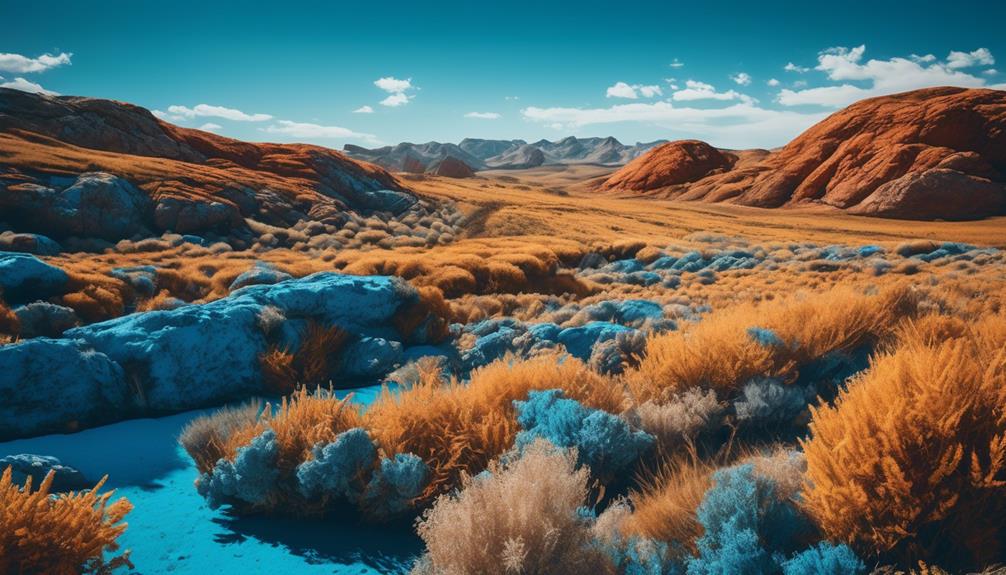
Warm and Cool Colors in Photography
After discovering the power of complementary colors and contrast in your photography, it's time to explore the captivating world of warm and cool colors. Understanding color temperature and white balance in photography is essential to creating visually stunning images that evoke the desired mood and emotions.
Color temperature refers to the warmth or coolness of a particular color. Warm colors, such as red, orange, and yellow, are associated with energy, passion, and vibrancy. They can make a scene feel cozy and inviting. On the other hand, cool colors like blue, green, and purple evoke a sense of calmness, serenity, and tranquility. They can create a more peaceful and soothing atmosphere.
The choice of warm or cool colors in your photography can greatly impact the mood and emotions conveyed in your images. For example, a sunset photograph with warm hues of red and orange can evoke feelings of romance and warmth. In contrast, a landscape shot with cool tones of blue and green can create a sense of serenity and relaxation.
To achieve the desired color temperature in your photos, it's crucial to master the concept of white balance. White balance ensures that the colors in your image appear natural and accurate. It allows you to adjust the color temperature according to the lighting conditions, whether it's the warm golden hour light or the cool blue light of a cloudy day.
Experimenting with warm and cool colors can breathe life into your photography and add depth and emotion to your images. By understanding the impact of color on mood and emotions, you can create visually striking and captivating photographs that leave a lasting impression on your viewers.
Using Color Harmony in Your Photos
Let's explore the art of using color harmony to create visually captivating and harmonious photos. When it comes to photography, colors play a vital role in conveying emotions and setting the mood of an image. By understanding color symbolism in photography, you can harness the power of colors to create impactful and memorable photos.
Here are three ways you can create mood with color in your photos:
- Contrast: Experiment with contrasting colors to add drama and depth to your images. Pairing warm and cool colors, such as red and blue, creates a striking visual effect that demands attention.
- Analogous Colors: Utilize analogous colors that are next to each other on the color wheel to create a cohesive and harmonious look. This technique can evoke a sense of tranquility and balance in your photos.
- Monochromatic: Explore the power of a single color by using different shades, tints, and tones. This technique can create a sense of unity and simplicity, enhancing the mood and atmosphere of your photos.
The Psychology of Color in Photography
Understanding the impact of color on our emotions and perceptions is essential for creating compelling and captivating photographs. Color symbolism in photography plays a significant role in conveying the intended message and evoking specific emotions in the viewer. Colors have the power to communicate feelings and ideas without the need for words. By strategically incorporating colors into our compositions, we can enhance the narrative and create a more immersive visual experience.
Color temperature, another crucial aspect of color psychology in photography, refers to the warmth or coolness of a color. Warm colors like red and orange evoke feelings of energy, passion, and excitement. On the other hand, cool colors such as blue and green elicit a sense of calmness, tranquility, and serenity. Understanding how color temperature impacts emotions allows photographers to manipulate the mood and atmosphere of their photographs.
Applying Color Theory Techniques in Post-Processing
When it comes to post-processing your photographs, applying color theory techniques can elevate your images to a whole new level of visual impact and storytelling. By using color grading techniques, you can enhance the mood and atmosphere of your photos, creating a more immersive experience for your viewers.
Here are three ways you can apply color theory in post-processing:
- Adjusting the white balance: By fine-tuning the temperature and tint of your image, you can completely transform its overall feel. Cool tones can evoke a sense of calm and tranquility, while warm tones can create a cozy and inviting atmosphere.
- Enhancing complementary colors: Utilizing the power of complementary colors can make your subject pop and add a dynamic contrast to your image. For example, if your subject is wearing blue, adding a touch of orange to the background can make them stand out even more.
- Using color grading presets: Many photo editing software offer color grading presets that can instantly change the look and feel of your image. Experiment with different presets to find the one that best fits the mood and emotion you want to convey.
Frequently Asked Questions
How Does Color Theory Affect the Composition of a Photograph?
Color theory plays a crucial role in the composition of a photograph. The psychological impact of color in photography is immense, as it can evoke different emotions and moods.
By understanding color theory, newbie photographers can use techniques to create visual harmony in their photographs. They can experiment with complementary colors, create balance through color contrast, and use color to guide the viewer's eye.
Mastering color theory opens up a world of creative possibilities and helps create innovative and captivating photographs.
Can Color Theory Help in Creating a Specific Mood or Atmosphere in a Photograph?
Color theory plays a vital role in creating a specific mood or atmosphere in a photograph. By understanding the impact of different colors and their combinations, I can manipulate the viewer's emotions and enhance the overall feel of a portrait.
Additionally, the role of lighting is crucial in setting the right mood. By using warm or cool lighting, I can create a sense of warmth or coldness, respectively, which further enhances the emotional impact of the photograph.
Are There Any Specific Color Combinations That Are More Pleasing to the Eye?
In my experience, certain color combinations can be more visually appealing to the eye. Understanding the impact of color psychology on viewer perception is crucial.
By exploring complementary and analogous color schemes in photography, we can create captivating images that evoke specific emotions and moods. These color combinations have a way of drawing the viewer in and making the photograph more engaging.
It's exciting to experiment with different color palettes and see the innovative results they can bring to our photography.
How Can I Use Color Theory to Enhance the Subject of My Photograph?
To create visually striking images, I've found that understanding color theory is crucial. By choosing the right color palette for your subject, you can enhance its impact and evoke specific emotions in your audience.
Experiment with complementary colors to create contrast or analogous colors for a harmonious feel. Don't be afraid to push the boundaries and try innovative combinations. Color theory opens up a world of possibilities for newbie photographers seeking to captivate viewers with their photographs.
Are There Any Common Mistakes to Avoid When Applying Color Theory in Photography?
When it comes to applying color theory in photography, there are some common mistakes that we should avoid.
One practical tip is to be mindful of color harmony and balance. It's important to understand the emotional impact that different colors can have on the viewer.
Another mistake to avoid is overusing or saturating colors, as it can distract from the subject.
Conclusion
In conclusion, understanding color theory is essential for photographers looking to create visually striking and impactful images.
By utilizing the principles of the color wheel, exploring complementary colors and contrast, and harnessing the emotional power of warm and cool tones, photographers can elevate their work to new heights.
Whether it's in the composition stage or during post-processing, applying color theory techniques can transform ordinary photos into extraordinary ones.
So, embrace the world of color and let your creativity soar!