Please note this post may contain affiliate links picked by me (Jay) that I have deemed may be of interest or relevant to you the reader of this.
These links do not affect the cost of the thing if you decide to purchase but i may get a little money if you choose to purchase.
For more information on my affiliate link policy click here.
Colors are like the paintbrushes of the visual world, allowing us to create masterpieces that captivate the eye and evoke emotions within our viewers. As a photographer, understanding the power of color theory can truly elevate your craft and take your photos from ordinary to extraordinary.
In this discussion, I will share with you the four best tips on how to boost your photography using color theory. Trust me, these tips will not only enhance the visual impact of your images but also give you the ability to tell stories and convey moods like never before.
Get ready to unlock the secrets of color and transform your photography into a work of art.
Key Takeaways
- Color symbolism and color psychology are important in photography for capturing attention and evoking emotions.
- Utilizing color contrast enhances the impact and visual interest of photographs.
- Colors have the ability to enhance mood and evoke specific emotions.
- Strategic color choices can create impact, meaning, and enhance the desired mood or emotion in photographs.
Understanding Color Harmony
Understanding color harmony is essential for creating visually appealing and impactful photographs. Color symbolism and color psychology play a crucial role in capturing the viewer's attention and evoking specific emotions.
As a photographer, I've come to appreciate the power of color in my work, as it allows me to convey my message effectively and engage my audience on a deeper level.
Color symbolism refers to the cultural and personal associations we have with different colors. For example, red often represents passion, energy, and strength, while blue is associated with tranquility, trust, and stability. By understanding these symbolic meanings, I can strategically incorporate colors into my compositions to enhance the desired mood or message.
Color psychology, on the other hand, delves into the psychological effects that colors have on our emotions and behavior. Warm colors like red, orange, and yellow tend to evoke feelings of excitement and happiness, while cool colors such as blue and green promote calmness and relaxation. By utilizing these principles, I can guide the viewer's gaze and create a harmonious visual experience.
Innovation in photography lies in pushing the boundaries and experimenting with new techniques. Understanding color harmony allows me to be more creative and innovative in my approach. By intentionally choosing color combinations that complement and enhance each other, I can create photographs that are visually striking and memorable.
Utilizing Color Contrast
Now that we've explored the importance of color symbolism and psychology in photography, let's dive into the exciting world of utilizing color contrast to take our images to the next level.
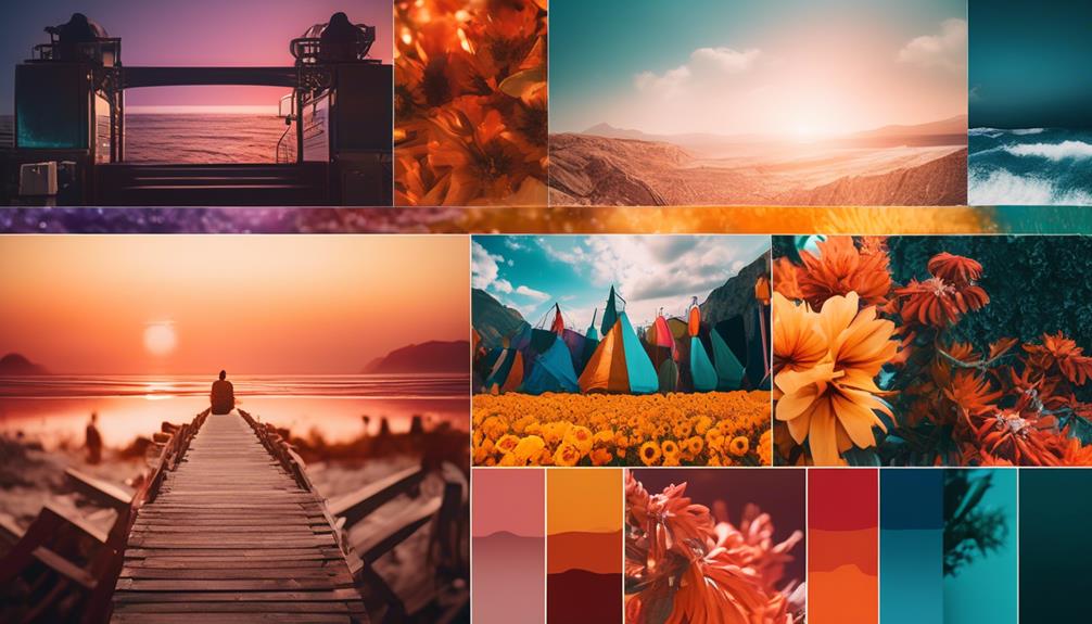
Color contrast is a powerful tool that can enhance the impact and visual interest of your photographs. By understanding color psychology and color temperature, you can create captivating images that captivate your audience and leave a lasting impression.
Color contrast refers to the juxtaposition of different colors in an image. It can be achieved by combining colors that are opposite on the color wheel, such as red and green, or by using colors with varying degrees of brightness or saturation. The key is to create a visual balance that draws the viewer's eye and adds depth and dimension to your photos.
When it comes to color psychology, contrasting colors can evoke different emotions and moods. For example, pairing warm colors like red and orange with cool colors like blue and green can create a sense of balance and harmony. On the other hand, contrasting complementary colors like yellow and purple can create a vibrant and energetic feel.
Color temperature also plays a crucial role in color contrast. Warm colors, such as red and orange, tend to advance and grab the viewer's attention, while cool colors, like blue and green, recede and create a sense of depth. By strategically using warm and cool colors in your composition, you can guide the viewer's gaze and create a dynamic and engaging image.
Enhancing Mood With Color
How can we use color to enhance the mood of our photographs and create a powerful emotional impact? The answer lies in understanding color symbolism and color psychology.
Colors have the ability to evoke specific emotions and feelings, and as photographers, we can harness this power to enhance the mood of our images.
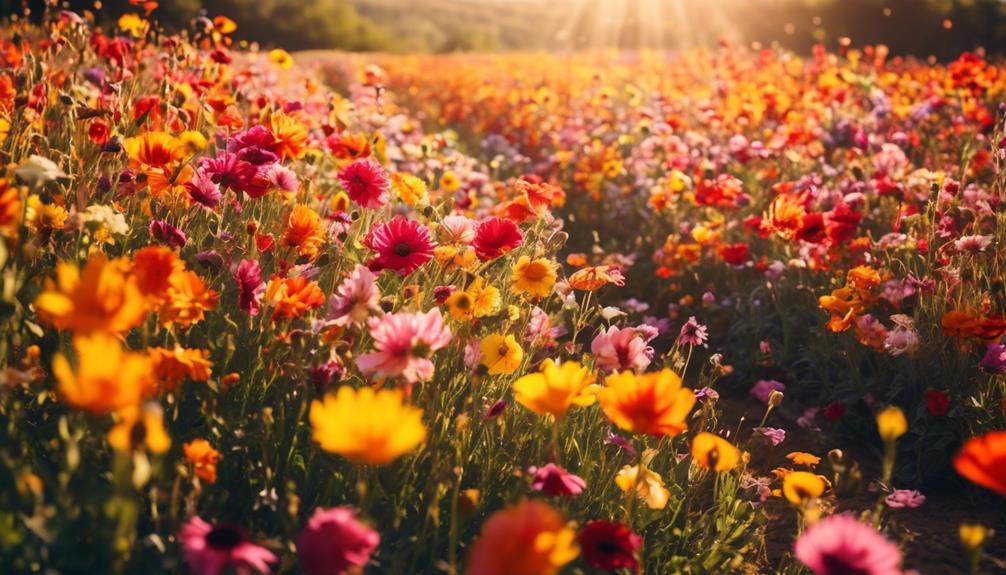
Color symbolism plays a significant role in photography. Each color has its own meaning and can convey different emotions. For example, warm colors like red and orange are often associated with energy, passion, and excitement. On the other hand, cool colors like blue and green can evoke feelings of calmness, tranquility, and serenity. By choosing colors carefully, we can create a visual language that resonates with viewers and elicits the desired emotional response.
Color psychology also plays a crucial role in enhancing mood. Certain colors have been scientifically proven to affect our emotions and behavior. For instance, studies show that the color blue has a calming effect and can reduce stress and anxiety. Yellow, on the other hand, is associated with happiness and optimism. By understanding the psychological impact of colors, we can strategically incorporate them into our compositions to elicit specific emotional responses from our viewers.
As photographers, it's essential to experiment with color and explore the different ways it can enhance the mood of our photographs. By understanding color symbolism and color psychology, we can create images that not only captivate the eye but also deeply resonate with the viewer on an emotional level.
Creating Impact With Color
Let's explore the transformative power of color and how it can create a captivating impact in our photographs. Color is more than just a visual element; it has the ability to evoke emotions, set the mood, and convey meaning. By understanding color theory and utilizing it effectively, we can take our photography to the next level.
One way to create impact with color is by using complementary colors. These are colors that are opposite each other on the color wheel, such as blue and orange, or red and green. When placed together, complementary colors create a vibrant contrast that immediately grabs the viewer's attention. This technique can be used to highlight a subject or to add drama to a scene.
Another aspect to consider is color psychology. Different colors have different psychological effects on viewers. For example, warm colors like red and yellow are often associated with energy and excitement, while cool colors like blue and green are calming and soothing. By understanding these effects, we can strategically choose colors that enhance the desired mood or emotion in our photographs.
To illustrate the impact of color in photography, let's take a look at the following table:
| Color | Psychological Effect | Example Use in Photography |
|---|---|---|
| Red | Energy, passion | Capturing a fiery sunset |
| Blue | Calm, serenity | Photographing a tranquil lake |
| Yellow | Happiness, optimism | Showcasing vibrant flowers |
| Green | Nature, growth | Portraying a lush forest |
Frequently Asked Questions
How Can I Effectively Use Color Theory to Enhance the Composition of My Photographs?
Using color theory in photography can greatly enhance the composition of your photographs. By understanding the psychology of color, you can create a mood and evoke emotions in your viewers.
Experiment with contrasting colors to make your subject stand out, or use complementary colors to create a harmonious and balanced composition.
Don't be afraid to play with different color palettes and combinations to bring innovation to your photography.
With color theory, the possibilities are endless!
Are There Certain Color Combinations That Work Better for Specific Types of Photography, Such as Landscapes or Portraits?
Certain color combinations can indeed enhance different types of photography.
For landscapes, vibrant and contrasting colors like a deep blue sky against lush green fields can create a striking effect.
In portraits, softer and complementary colors like pastels can help create a more harmonious and pleasing composition.
In fashion photography, bold and vibrant colors can make a statement and add a sense of drama and excitement.
And in food photography, warm and appetizing colors like rich reds and golden yellows can make the viewer's mouth water.
What Are Some Practical Tips for Using Color Theory to Create a Visually Balanced Photo?
When it comes to creating a visually balanced photo, there are some practical tips that can make a big difference.
One important aspect is understanding color theory and how different colors can interact with each other. By using complementary colors, for example, you can create a sense of harmony and balance in your photos.
Another tip is to pay attention to color temperature and how it can affect the mood of your image. By experimenting with different color combinations and understanding the impact they have, you can take your photography to the next level.
Can You Provide Examples of Famous Photographers Who Have Successfully Utilized Color Theory in Their Work?
Let me start by saying that color theory is a powerful tool in photography. It can elevate your work to a whole new level, just like a master painter adding brushstrokes of genius.
When it comes to famous photographers who've successfully utilized color theory, names like Steve McCurry, Annie Leibovitz, and William Eggleston come to mind. These visionaries have created stunning images by understanding the impact of color on composition, emotion, and storytelling.
Are There Any Specific Post-Processing Techniques or Tools That Can Help Me Enhance the Colors in My Photographs Based on Color Theory Principles?
There are several post-processing techniques and tools that can help enhance the colors in your photographs based on color theory principles.
One technique is adjusting the white balance to ensure accurate color representation.
Additionally, you can use selective color adjustments to make certain colors pop or create a specific mood.
Tools like Adobe Lightroom and Photoshop offer a wide range of options for color enhancement, allowing you to experiment and bring your photographs to life with vibrant and impactful colors.
Conclusion
In conclusion, understanding color theory is essential for enhancing the impact and mood of your photography.
By using color harmony, contrast, and intentionally selecting hues to evoke specific emotions, you can create visually stunning and captivating images.
Don't be afraid to experiment and push the boundaries of color in your photography, as it can truly elevate your work to new heights.
So go out there and let your creativity shine through the power of color!